
It’s been a quiet few weeks, mostly occupied with Real Life ™, but I’ve not been entirely idle on the game dev front.
I’ve been experimenting with background graphic styles.
I’m using the C64’s standard character mode, which means I’ve got 256 single-colour 8x8 characters I can define. But a good share of those 256 characters are already needed for letters, numbers, smashables and various other special uses. So They’re quite a limited resource.
The screen is the C64 standard 40x25 characters, and I can pick a unique colour for each position from the C64’s glorious (if slightly muddy-looking) 16 colour palette.
I’ve already expanded the map from 25 screens to 49, so I’m definitely going to have to watch the memory use. The more complicated the screen layout, the worse it will compress. It’s going to be pretty tight.
I do want different parts of the UFO (did I even mention the game was set inside a UFO?) to have a distinct look and feel, to keep things visually interesting.
Here are the tests I’ve done so far:
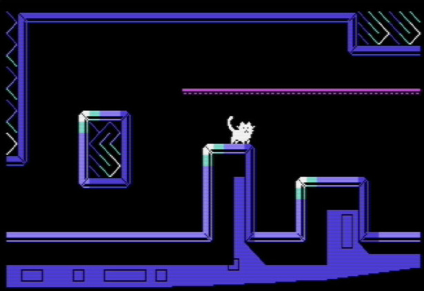
I like this one a lot, although I feel it doesn’t quite fit the style of the game - it’s a bit… busy. I feel like the game should have a “cleaner” look to it. But maybe I’ll change my mind and include it anyway :-)
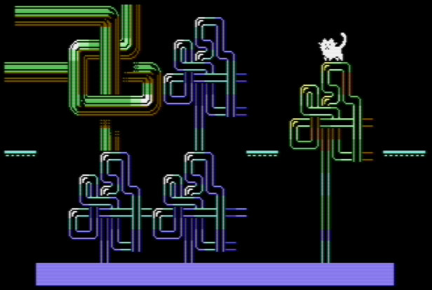
Bit of a squiggly flight of fancy with squiggly pipes. Lots of potential, but compression might become an issue if I did too much of this.
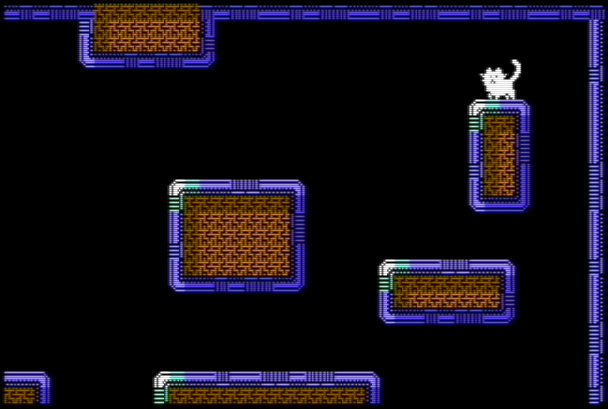
Feels like this one is almost there. Nice clean lines, and easy to read the screen. Compresses well too. This one will probably see a lot of use, in various colours and variations.
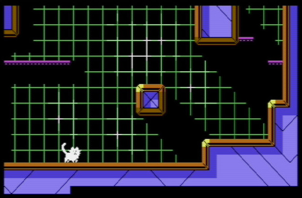
Experimenting with backgrounds here. I like the dramatic shadowing here and the retro-green grid, but it doesn’t compress so well. I think it also makes the game a little harder to read, visually.
If I use it, it’ll be sparingly. Maybe a VR/Holodeck area. Then again, maybe the game is trippy enough as it is…